You probably haven’t seen Logo Lounge’s 2018 Logo Trends Report. For all the artsy fartsy details click the link, but for my summary continue reading. Let’s go!
2018 Logo Trend Report Summary
- Clean, modern aesthetics are moving toward curvy retro designs
- Expressive serifs are coming back into popularity
- Nostalgic elements are being brought forward with contemporary aesthetics
- There’s greater intensity on color ranges due to digital screens “Make it POP!”
- Gradients are now being recognized as colors. Think Instagram.
What are the Logo Trends of 2018?
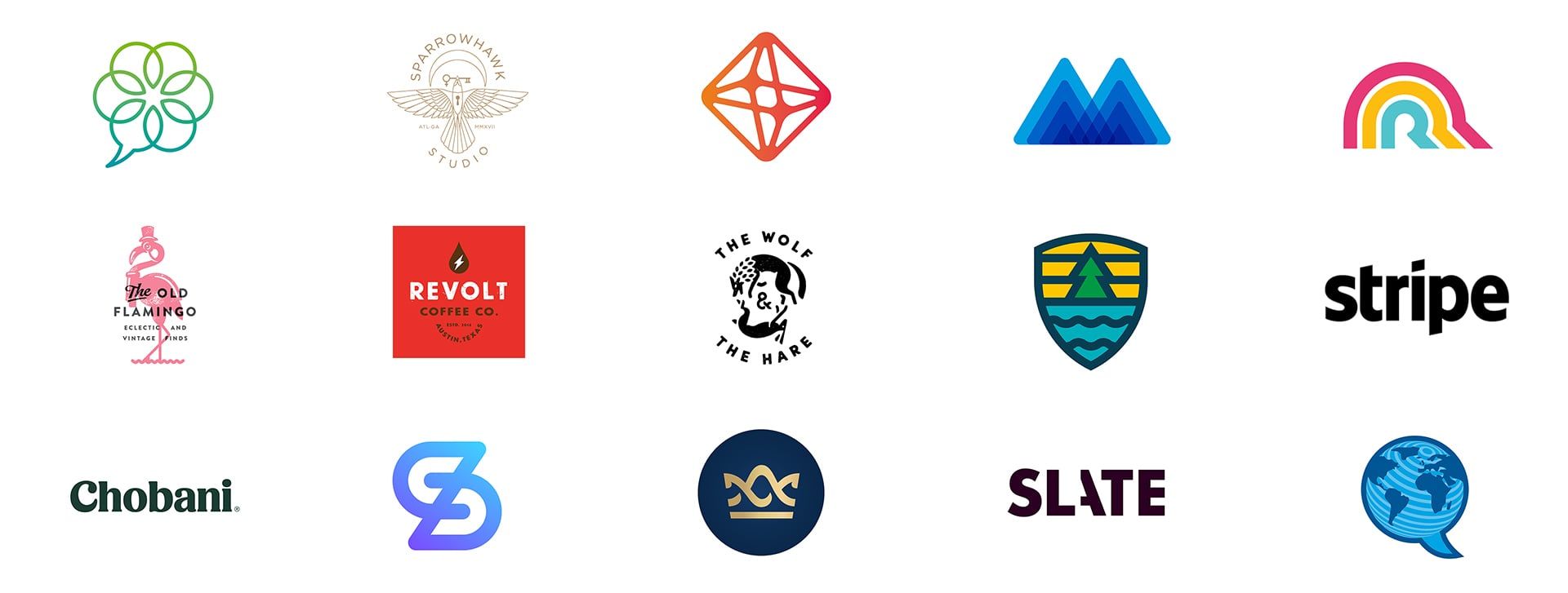
Here is a summary of the top 15 logo trends of 2018.
- Tumbled Logos
- Parallelograms
- Outlines
- Modern Religion
- Neo Vintage
- Black & White Hipster
- Established Trademarks
- Blurple
- Gold
- Fatty Fade
- Linear Fade
- Field Lines
- Cut
- Serif Redux
- Punctuation
Pictures below 🙂
Tumbled Logos
Over-amplifying & over-easing the effect of rounded corners.

Parallelogram Logos
Solutions that signal “up and to the right”, often with the shape of a rectangle (parallelogram).

Outlined Logos
Similar to classic sport team logos, an outline is added to the logo. It can make an unremarkable logo capture additional attention.

Modern Religion Logos
Rich symbolism displayed with multiple symbols, often giving a cult like feel.

Neo Vintage Logos
The new vintage… nostalgic logos. Often type is placed over the top of a supporting image.

Black & White Hipster Logos
A matured version of the recent classic hipster badges using traditional elements, displayed in a counter-traditional way.

EST TRD MRK Logos
Creating faux heritage through balanced design. EST. 2018? Yup.

Blurple
Is it blue or is it purple? No, it’s somewhere in between. That’s a blurple gradient. This trend explores new & less traditional color spectrums.

Gold Logos
Faux gold created by metallic, flat or gradient tones. Often used to communicate prestige, elegance, and sophistication.

Fatty Fade Trend
Combining the past and present with a contemporary aesthetic, often with fat lines.

Linear Fade Trend
Striped lines and channels.

Field Lines Logo Trend
Thick consistently girthed lines, reminiscent of the golden era of logos. Works well on small or large applications.

Cut Logo Design Trend
Cutting letter forms for stylistic gesture and disruption.

Serif Redux
Bringing back warmth, humanity and charm with serifs, to counter the soulless sans-serif of late.

Punctuation Logo Trend
Commas, periods, colons, all used to send a certain message.

So there you have it. Our power-walk through Logo Lounge’s 2018 logo trend report. All very interesting and might I add, inspiring designs. What do you think? Ready for a logo of your own? Want to update your existing logo?


Leave a Comment