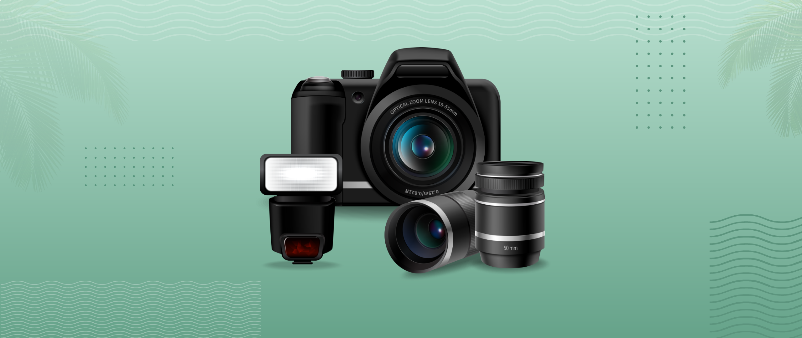
“A picture is worth a thousand words“
Photography can breathe life into your website, social media, or marketing efforts. With strategic photography planning, you can tell an entire story about your business, show off your business’s history, and establish a photogenic brand with a single frame.
Here are a few tips on utilizing photography in your design.
Personalized Photos > Stock Photos
Stock photography can, at times, seem like the easiest route when building out your brand’s content, but you may find yourself struggling to find images that look genuine and relevant to your brand. Yes, custom photography is a bit more work, but your website and marketing materials will benefit greatly from high-quality photos with a personal touch.
In the event that you absolutely can not use custom photography, be sure to utilize stock photography that feels real, and authentic. Too generic photography will not feel genuine. Make sure you do not use anything too cliché when choosing your photos.

Relevant Photos

It’s easy to get the viewer’s attention by using images. Matching your imagery to the content of your design will make it feel intentional and provide the user with the information they need.
Less is More

You don’t need to use too many images and clutter up your design. You also don’t need to use overly complicated photos to “wow” the viewer, either. A clean product photo on a gradient background would be enough to provide a clean and clear design.
Contrast & Harmony

When using text on photos, make sure the text is legible. Using photos with a composition to match your design makes the design feel intentional and interesting.
High-Quality Images Only

Using high-quality images will make your design feel professional. Pixelated photos can ruin a great design.
Consistency in Imagery

Create your imagery library consistent in their look and feel. They should be similar in color and style to create unity.
Size Does Matter
When choosing the size of your image, make sure you can see what the photo has to offer. Make sure the photo is clear to the user and doesn’t require extra effort or squinting to distinguish what they’re looking at.
On the other side of the spectrum, images that are too large may also ruin your viewer’s experience. A giant wall of full-screen images may bury the important content.
It’s up to you to determine the perfect balance.
Get Started Using Photos in Your Designs Today
With these tips, you’re ready to get started adding photos to your designs and wowing your audience with your ability to communicate your message through beautiful and relevant imagery.
Resources :
Here are a couple of our favorite free stock photography resources.
What’s your favorite stock photography resource? Let us know in the comments below!
Paid Resources


Leave a Comment